| Welcome | Charts | Advanced settings |
|---|
| Welcome | Charts | Advanced settings |
|---|
All properties of the chart component can be edited at runtime. Therefore, three editors are available to easily change properties of the panes, series and annotation elements. Panes editor Series editor Annotations editor |
|||||||||||||||||||||||||||||||||||||||||||||||||||||||||||||||||||||||||||||||||||||||||||||||||
|---|---|---|---|---|---|---|---|---|---|---|---|---|---|---|---|---|---|---|---|---|---|---|---|---|---|---|---|---|---|---|---|---|---|---|---|---|---|---|---|---|---|---|---|---|---|---|---|---|---|---|---|---|---|---|---|---|---|---|---|---|---|---|---|---|---|---|---|---|---|---|---|---|---|---|---|---|---|---|---|---|---|---|---|---|---|---|---|---|---|---|---|---|---|---|---|---|---|
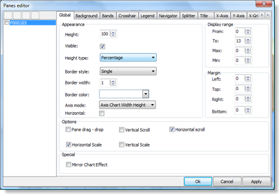 |
Height
Set the height in combination with 'Height type' to a fixed or autosize value. Height type
The type of the height when you have multiple panes : Example : There are 3 panes of height = 30
Axis mode
The 'Axis mode' allows you to change the drawing of the X-axis and Y-axis : Scaling and scrolling
The chart pane can be scaled in both X–direction and Y–direction. Set the property 'Vertical Scale' and/or 'Horizontal Scale' in the pane options to true. Then click and hold your mouse on the X-axis or Y-axis to scale the chart. You can also scroll left, right, up or down. Set the 'Horizontal Scroll' and/or 'Vertical Scroll' to true, click on the pane background and hold your mouse to scroll. Pane moving The chart pane can be moved to another position in the Chart viewer. Set the 'pane drag & drop' property to true in the pane options. Hold Shift + click and drag the pane above another pane. Then release the Shift + click and the pane will be dropped into the new location. Orientation
By default, a chart is shown in vertical direction. This means that the X-axis is at the bottom and the Y-axis at the left and/or right side of the chart. In some cases, it is desirable that the chart is shown in horizontal direction. The horizontal mode can be considered as a chart that is rotated -90° degrees. The Y-axis is at the bottom and/or top of the chart and the X-axis on the left side. The checkbox "Horizontal" controls the orientation of the chart by setting it to either Horizontal or Vertical. |
||||||||||||||||||||||||||||||||||||||||||||||||||||||||||||||||||||||||||||||||||||||||||||||||
The crosshair behaviour can be set per pane. When crosshairs are enabled, move the mouse in the pane area and values which intersect with the crosshair are shown either in the Y-axis area, at the crosshair intersection point or in a separate tracker window. |
|||||||||||||||||||||||||||||||||||||||||||||||||||||||||||||||||||||||||||||||||||||||||||||||||
 |
Type
There are 3 kinds of crosshair types you can use to locate the Y-values of a serie.
Values
Position Tracker | ||||||||||||||||||||||||||||||||||||||||||||||||||||||||||||||||||||||||||||||||||||||||||||||||
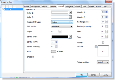 |
Display the legend text for the number of current chart series added to the chart pane. |
||||||||||||||||||||||||||||||||||||||||||||||||||||||||||||||||||||||||||||||||||||||||||||||||
 |
Scaling and scrolling |
||||||||||||||||||||||||||||||||||||||||||||||||||||||||||||||||||||||||||||||||||||||||||||||||
 |
Changing pane height |
||||||||||||||||||||||||||||||||||||||||||||||||||||||||||||||||||||||||||||||||||||||||||||||||
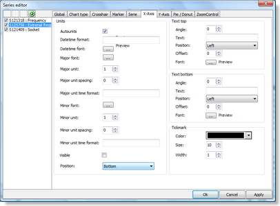
The X-axis displays the range of points in the chart in number format, a date/time format with unit types minute, day, month, year, custom drawn values or specified values per point. The X-axis supports scaling with mouse. The X-axis formatting can be set per pane and per serie. |
|||||||||||||||||||||||||||||||||||||||||||||||||||||||||||||||||||||||||||||||||||||||||||||||||
 |
Position Unit type |
||||||||||||||||||||||||||||||||||||||||||||||||||||||||||||||||||||||||||||||||||||||||||||||||
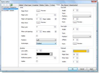
The Y-axis displays the range of series values from a defined minimum to maximum or via Autorange the best range can automatically be choosen. The Y-axis supports scaling with the mouse and/or keyboard. The Y-axis can be set at the left side of the chart, the right side of the chart or both sides. Different Y-axis values can be shown for different series. The Y-axis also has the capability to show major & minor units with a different font and formatting can be set per pane and per serie. |
|||||||||||||||||||||||||||||||||||||||||||||||||||||||||||||||||||||||||||||||||||||||||||||||||
 |
Position
This property changes the position of the Y-axis to left, right or will display a Y-axis at the left and the right in case the position is both. Auto units When 'Auto units' is set true, the chart calculates the best possible value and position based on the minimum and the maximum value. If 'Auto units' is false, you need to set the Major and the Minor unit properties to the difference between the first and the second value you want to see. Example there is a range from 0 to 10. Set the major unit to 2 and the minor unit to 1. Result : MajorUnit = 0, 2, 4, 6, 8, 10 / MinorUnit = 0, 1, 2, 3, 4, 5, 6, 7, 8, 9, 10. |
||||||||||||||||||||||||||||||||||||||||||||||||||||||||||||||||||||||||||||||||||||||||||||||||
The X-grid formatting can be set per pane. |
|||||||||||||||||||||||||||||||||||||||||||||||||||||||||||||||||||||||||||||||||||||||||||||||||
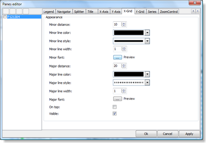 |
MajorDistance and MinorDistance If the X-grid is visible you can specify a Major or Minor Distance to draw the grid with smaller or larger steps. The X-grid line positions are defined in the same way as the X-axis value positions except that there is no AutoUnits property and the MajorUnit and MinorUnit properties must be filled before you can see the X-grid. |
||||||||||||||||||||||||||||||||||||||||||||||||||||||||||||||||||||||||||||||||||||||||||||||||
The Y-grid formatting can be set per pane. |
|||||||||||||||||||||||||||||||||||||||||||||||||||||||||||||||||||||||||||||||||||||||||||||||||
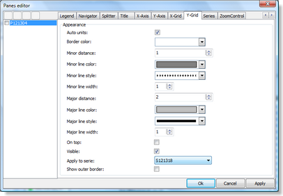 |
MajorDistance and MinorDistance
If the Y-grid is visible you can specify a Major or Minor distance to draw the grid with smaller or larger steps. Auto units
If 'Auto units' is true the Y-grid will be drawn at the same calculation as the Y-axis values. This means if there is no room to display minor units, the Y-grid will disappear. When 'Auto units' is false you can use the MajorDistance / MinorDistance on the same way as the X-grid. Serie index The Y-grid is related to the serie index because each serie can have its own Minimum and Maximum. Change the SerieIndex and the Y-grid will draw to match the new serie values. |
||||||||||||||||||||||||||||||||||||||||||||||||||||||||||||||||||||||||||||||||||||||||||||||||
The zoom control window allows the user to navigate through the chart and always displays the complete chart range by default. There are 2 handles that can be dragged left or right representing the RangeFrom and RangeTo of the Chart. The zoom control appearance can be customized in the Panes Editor Dialog. |
|||||||||||||||||||||||||||||||||||||||||||||||||||||||||||||||||||||||||||||||||||||||||||||||||
 |
Auto update By default the chart will be automatically updated when changing the range. The property 'Auto update' can be changed to update immediate, upon release of the mouse button, or no automatic update. |
||||||||||||||||||||||||||||||||||||||||||||||||||||||||||||||||||||||||||||||||||||||||||||||||
Choose a chart type Choosing the right chart type to visualize your data depends on the data you are using. Below is an overview of the current available chart types and when to use them :
|
|||||||||||||||||||||||||||||||||||||||||||||||||||||||||||||||||||||||||||||||||||||||||||||||||
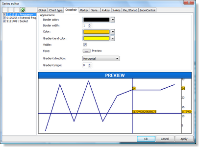 |
Crosshair When the crosshair is enabled you can set different graphical settings to display serie values or y–position values found at the crosshair. With the different types of crosshairs, you can draw horizontal lines where the value was found. When "full size crosshair at series" crosshair type is chosen a horizontal line will automatically be drawn where a serie value is found. |
||||||||||||||||||||||||||||||||||||||||||||||||||||||||||||||||||||||||||||||||||||||||||||||||
 |
Marker A marker can be selected. Set the SelectedColor and the SelectedSize property. Click on the marker at runtime, the marker will be shown in the selected color & size. |
||||||||||||||||||||||||||||||||||||||||||||||||||||||||||||||||||||||||||||||||||||||||||||||||
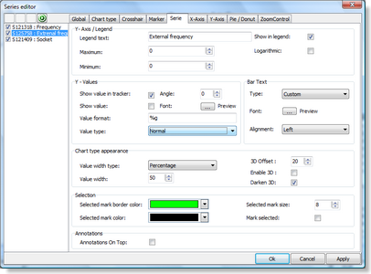 |
Legend text
The legend text that will be displayed in the legend. Logarithmic Y-Scale
Transforms the Linear Y-Scale into a Logarithmic Y-Scale. By default, the Y-axis scale on charts is a linear scale. For scientific applications, it is often mandatory to use a logarithmic scale. When using a logarithmic Y-scale the MajorUnit is automatically set to 1 and cannot be changed. This means that on the Y-axis values 1,10,100,1000,… will be shown. The MinorUnit can be set for the Y-Axis and the Y-Grid to a value of choice. Note that the logarithmic Y-scale is only supported for single value chart types. Different serie values on the left and/or right size of the Y-axis You can add multiple series per pane. Usually the series have a common value range and the Autorange mode Common will be chosen. When adding series which do not have a common value range, use the Autorange mode Enabled, and set property serie Y-axis position to left / right / both. You can choose a matching font color for values in the Y-axis that match the serie color for example to easily identify which values belong to which serie. Another feature is formatting of the value. Set a format in the Value format property of the serie. Format specifiers have the following form : "%" [index ":"] ["-"] [width] ["." prec] type A format specifier begins with a % character. After the % come the following, in this order :
|
||||||||||||||||||||||||||||||||||||||||||||||||||||||||||||||||||||||||||||||||||||||||||||||||
The following table summarizes the possible values for type :
Conversion characters may be specified in uppercase as well as in lowercase—both produce the same results. For all floating-point formats, the actual characters used as decimal and thousand separators are obtained from the DecimalSeparator and ThousandSeparator global variables or their TFormatSettings equivalent. In the sample below, the Y-axis Value format on the left side was set to ‗%gK‘ and for the right side ‗%.1f‘. |
|||||||||||||||||||||||||||||||||||||||||||||||||||||||||||||||||||||||||||||||||||||||||||||||||
 |
MajorUnit and MinorUnit MajorUnit and MinorUnit is used to determine the X-axis values on Serie level. If you set the MajorUnit to 2, the values will range from RangeFrom to RangeTo in steps of 2 (0, 2, 4, 6, …). |
||||||||||||||||||||||||||||||||||||||||||||||||||||||||||||||||||||||||||||||||||||||||||||||||
 |
MajorUnit and MinorUnit
When 'Auto units' is false on pane level you must specify a MajorUnit and MinorUnit to determine the Y-axis values on Serie level. AutoRange The 'AutoRange' property determines how the series are displayed with an automatically calculated minimum and a maximum value range. There are 5 types you can choose from depending on the chart type you choose :
|
||||||||||||||||||||||||||||||||||||||||||||||||||||||||||||||||||||||||||||||||||||||||||||||||
 |
Serie type When you start the application, the zoomcontrol window will be empty. Therefore it is important to link the series by setting the 'Serie type' property. The 'Serie type' property specifies how and what series from the serie collection of the chart is used on the zoomcontrol :
|
||||||||||||||||||||||||||||||||||||||||||||||||||||||||||||||||||||||||||||||||||||||||||||||||
 |
Annotations editor The annotations editor dialog is a smaller editor which only edits the annotations attached to the serie. Annotations are used to mark important points or to display comments about the points. There are different kinds of annotations :
|
||||||||||||||||||||||||||||||||||||||||||||||||||||||||||||||||||||||||||||||||||||||||||||||||
© 2009, 2010 Aplixio. All rights reserved |
|||||||||||||||||||||||||||||||||||||||||||||||||||||||||||||||||||||||||||||||||||||||||||||||||